New York Comedy Festival Rebranding
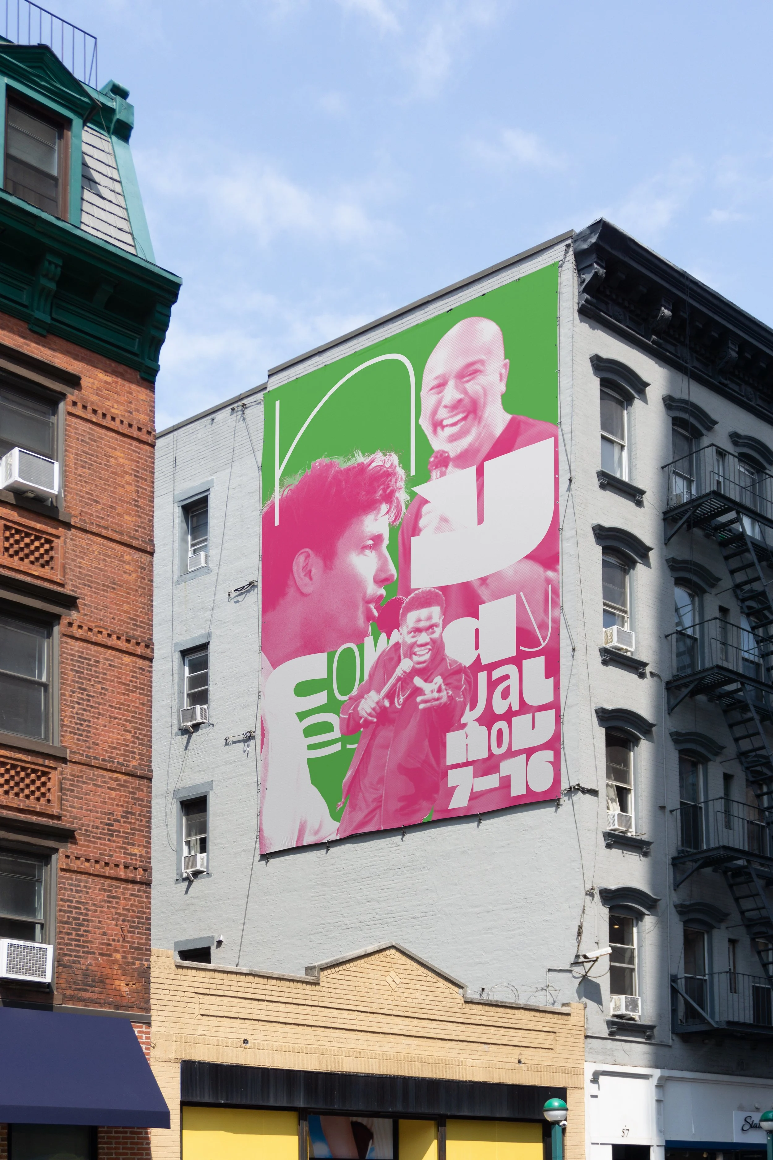
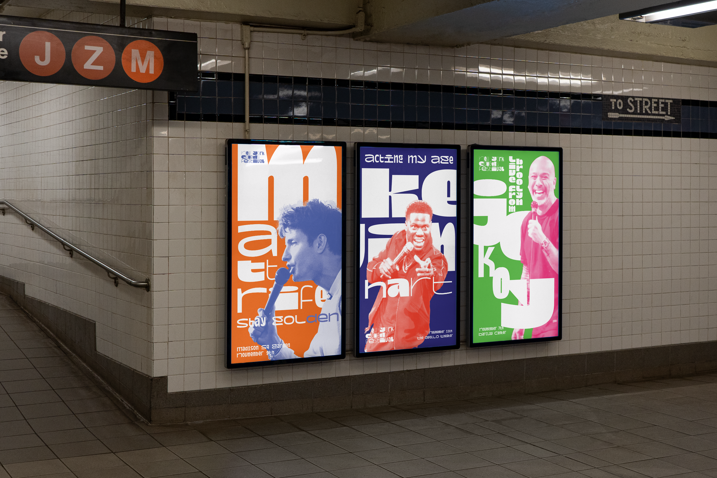
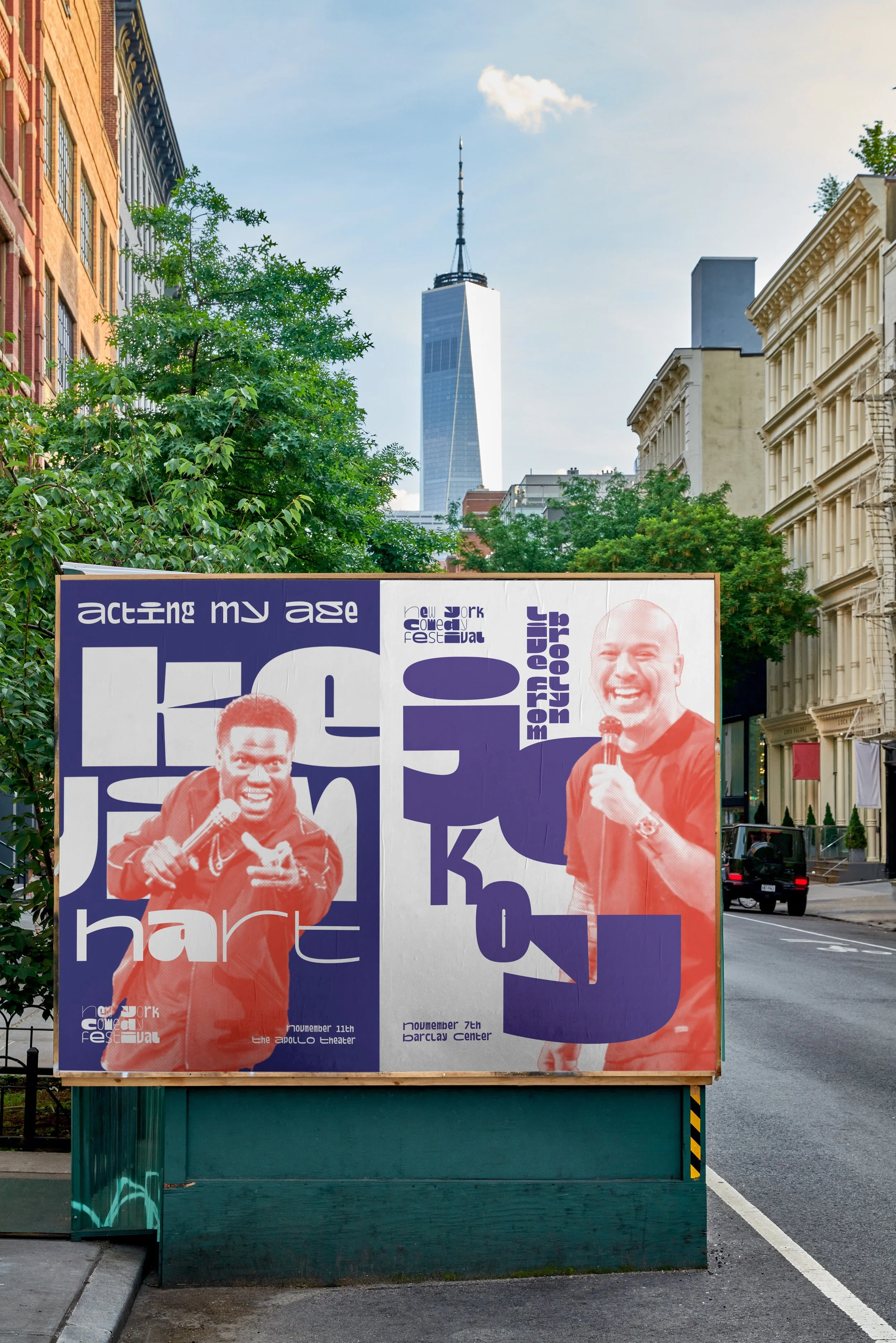
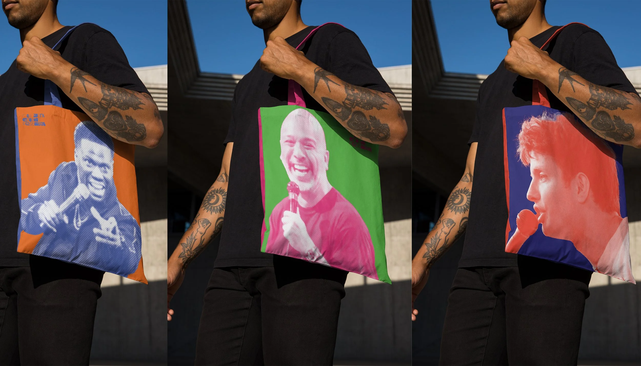
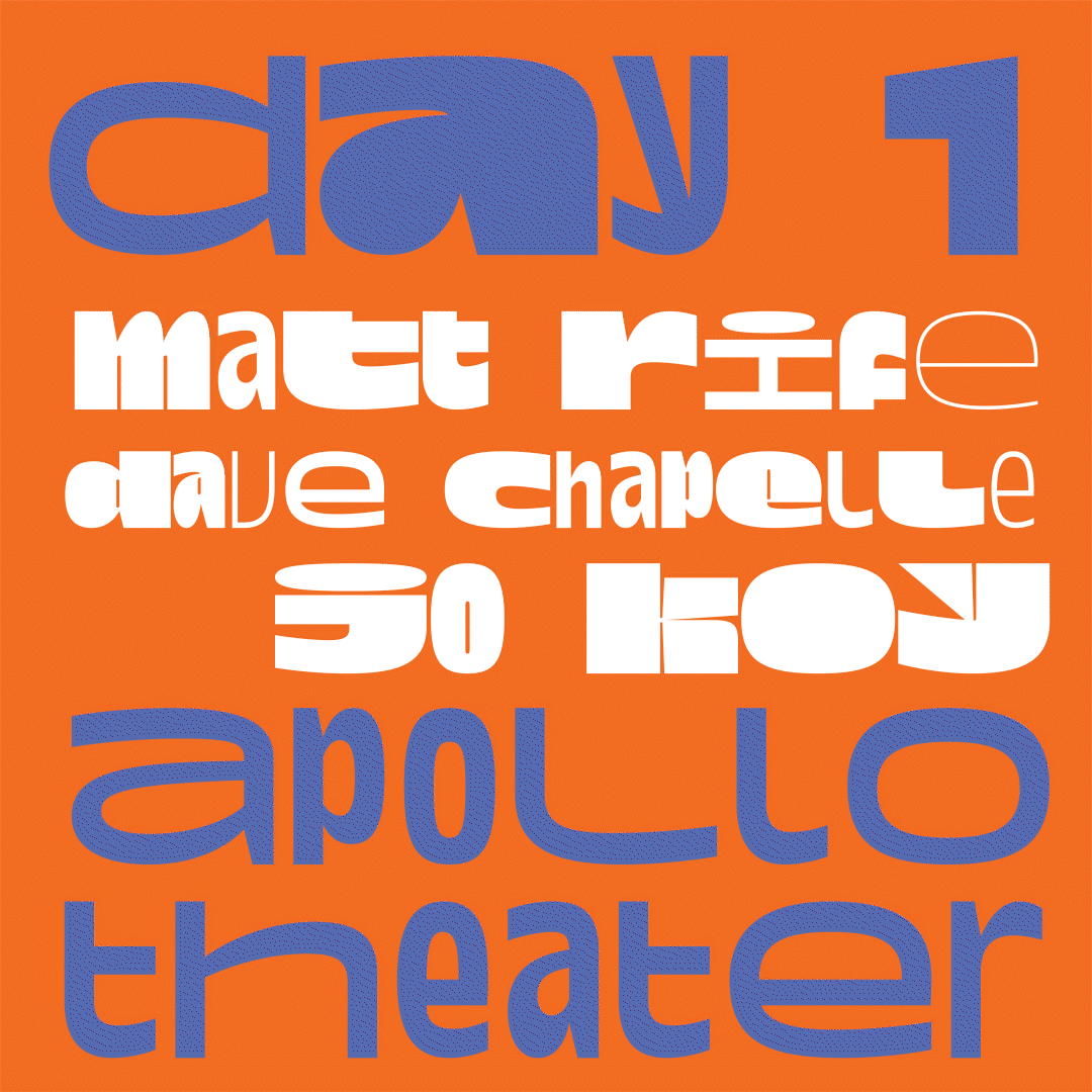
New York is a city full of vibrancy and diversity, yet the current logo for the New York Comedy Festival doesn't fully capture that spirit. This rebranding brings a playful tone without leaning into cliché “comedic” visuals, instead using a typeface with dramatically varied weights to create a dynamic, engaging logo.
A bold color palette and halftone images of featured comedians on posters and billboards further highlight the festival's energetic character. The entire visual system centers on contrast—through color, typography, and scale. This project aims to infuse the festival’s identity with the lively, eclectic energy of New York City itself.